Web Design
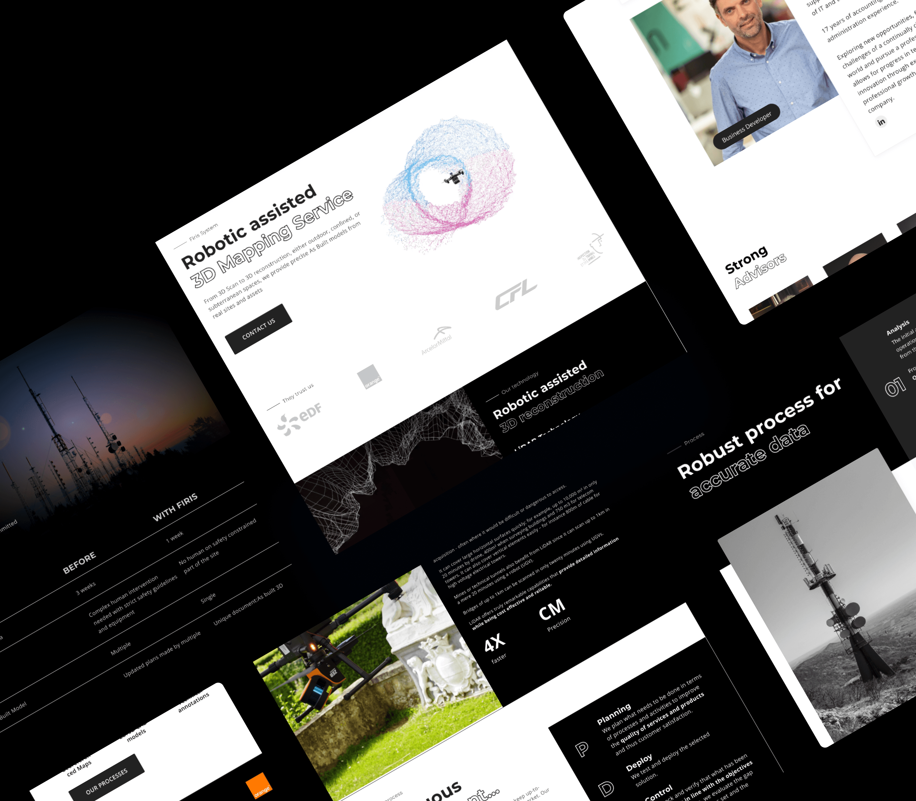
FIRIS is a company offering drone-based AI and infrared inspection solutions for infrastructure like electrical grids and communication towers. The UX objective was to clarify a complex product through structured design, visual storytelling, and intuitive navigation, making advanced technology accessible and trustworthy for industry professionals.
Challenge
The product combines AI, drone technology, and thermal imaging—all highly technical and potentially abstract for non-engineers. The challenge was to:
Organize dense content into a clear and navigable structure.
Explain the system in simple terms.
Highlight real-world usage without overwhelming the user.
Information Architecture
The site structure is minimal and deliberately segmented:
Technology – What the product is and how it works.
Use Cases – Real-world applications organized by sector (e.g. telecom, energy).
News & Media – Reinforces credibility and activity in the field.
About & Team – Puts a human face behind the technology.
Contact – Persistent CTA across the experience.
Each section is standalone yet flows naturally from one to another. The architecture encourages progressive discovery, allowing users to start anywhere and still reach the same understanding.
Design Interpretation
The visual design is sharp, modern, and dark-themed, creating a sense of technical precision and seriousness. The contrast between black backgrounds and vivid thermal images draws the eye to key visual content. The layout uses a clear grid system, keeping content digestible and visually aligned.
Text blocks are kept short, broken into scannable sections. Headers are used effectively to separate information and allow for fast reading—crucial when explaining complex technology.
Use of Video
A prominent hero video on the homepage establishes the product narrative instantly. It shows the drone in action, overlays of AI analysis, and real-life inspections. The video is silent by default, allowing for ambient storytelling without disrupting the experience. This helps explain the product visually before any technical language is introduced.
Vulgarization of Technical Content
Rather than using scientific jargon, the language across the site is:
Action-oriented (“Inspect,” “Analyze,” “Secure”).
Focused on results, not mechanisms.
Accompanied by visuals (e.g. thermal overlays, drone perspectives) to reduce the need for lengthy explanations.
Use cases are presented with simple headlines, imagery, and short descriptions—offering just enough information to understand the benefit without technical overload.
Results
Clear navigation and modular pages suggest intentional UX flow focused on comprehension.
Repetition of layout patterns and image formats helps establish a visual rhythm, aiding retention and exploration.
Use of real imagery and short testimonials implies a focus on building trust without relying on abstract claims.