Web design
Touloisirs, a French non-profit focused on accessible travel and leisure, sought a redesigned website to improve usability, elevate aesthetics, and boost user engagement.
Challenge
Enhance user interface (UI) to align with Touloisirs' friendly, accessible brand.
Improve navigation for seamless access to travel and leisure offers.
Increase overall user satisfaction by simplifying information discovery.
Research
The design process was informed by both qualitative and quantitative data from user surveys and user interviews. Our research revealed several pain points that users experienced with other similar platforms, including:
Complex navigation due to overly nested menus.
Overwhelming booking flows that lacked clarity, making the reservation process long and complicated.
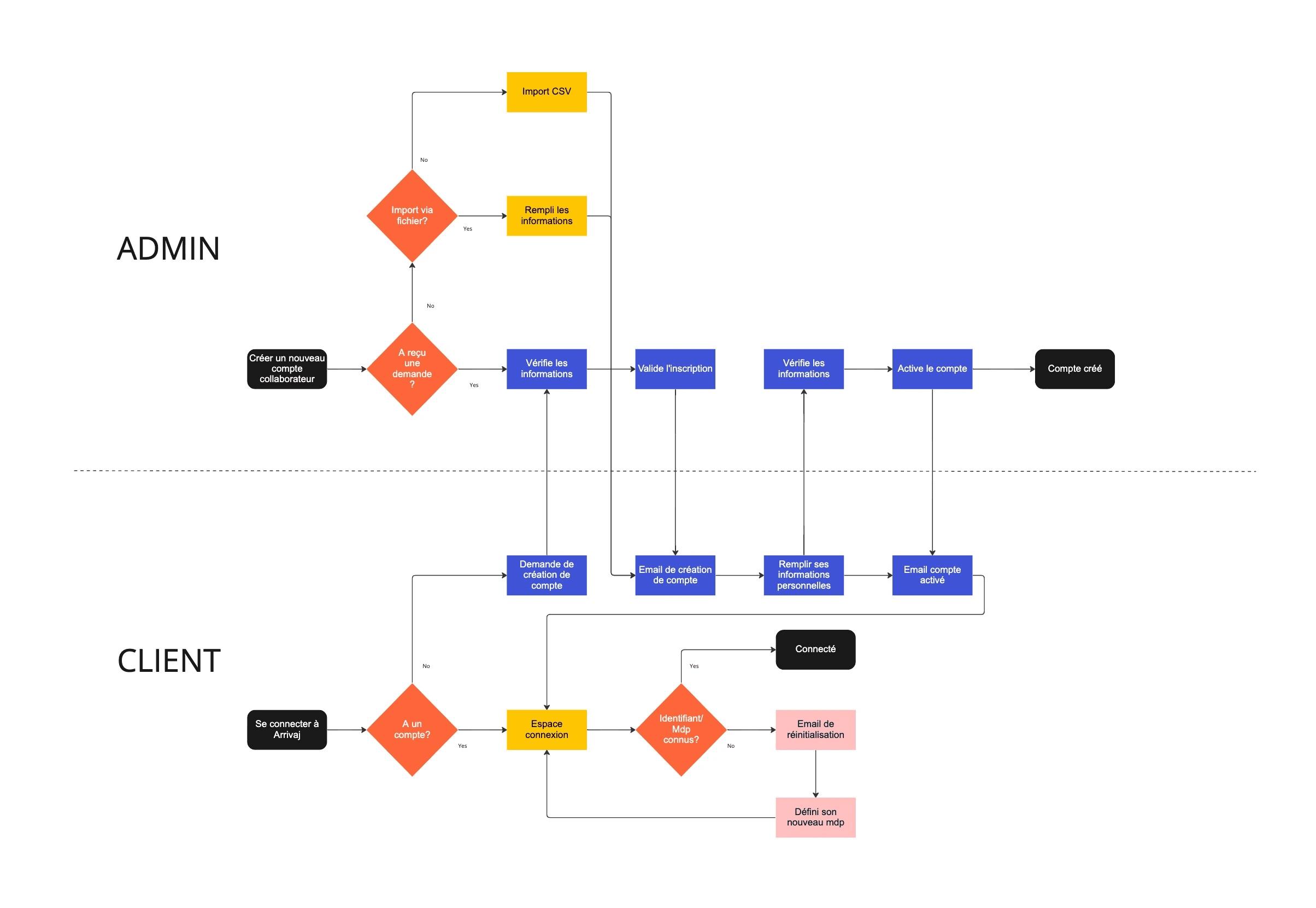
Account management frustrations, where users struggled with profile creation and password management.
Benchmark
AI-Assisted Benchmarking for Competitive Analysis and Feature Development
In order to ensure that the redesign of the Touloisirs platform was competitive and aligned with industry best practices, I utilized AI-driven tools to conduct a thorough benchmarking analysis of competitor platforms. This process was instrumental in informing not only the initial design but also the evolution of new features introduced throughout the project.
Feature Comparison
For each new feature, AI was used to compare Touloisirs' design elements with those of the leading platforms. For example, AI-driven tools analyzed how competitors structured their booking flows, account management systems, and navigation menus. This comparative analysis provided actionable insights into areas where Touloisirs could improve, such as optimizing booking times or enhancing mobile responsiveness.
Solution
To address the challenge, I proposed the following solutions:
Simplicity in Navigation:
Streamlined the site map, ensuring easy access to all primary sections such as Search, Products, and User Profile.
Integrated contextual menus and sticky navigation to ensure users could always see key actions.

Clear User Flow:
Designed simplified booking processes that were easy to follow, and included visual cues that guided users step-by-step.
Utilized clean, organized card layouts to display available products or services, making it easier to scan and select options.
Mobile-First Design:
Ensured that the design was responsive and optimized for mobile users, providing them with a smooth browsing experience on all devices.
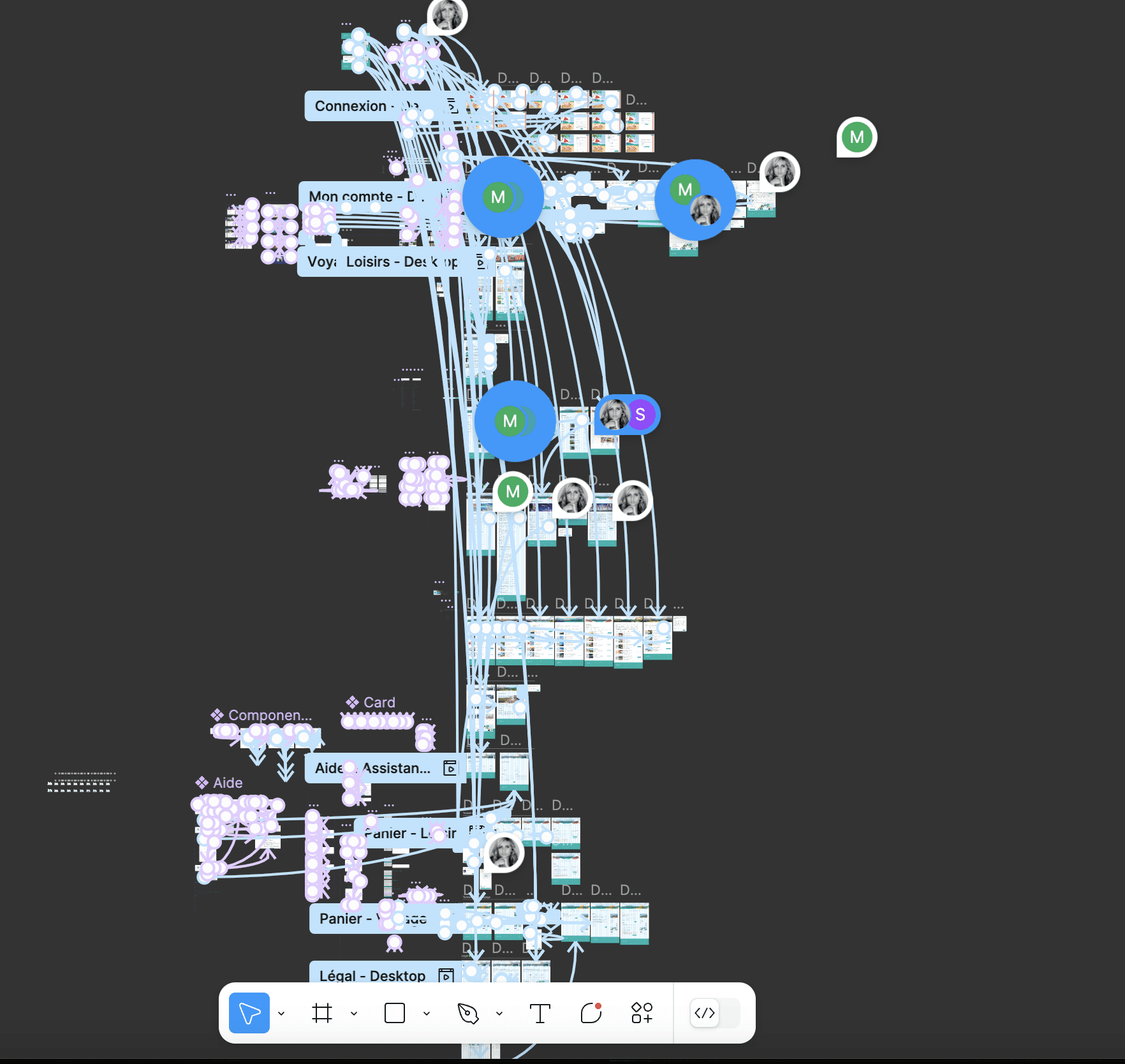
Wireframes & Prototypes
Created detailed wireframes to outline the structure of the website and key interfaces, such as the user account management system and booking interface.
Developed interactive prototypes using Figma to visualize how the user flows would work in practice, allowing for early-stage feedback and adjustments before development.

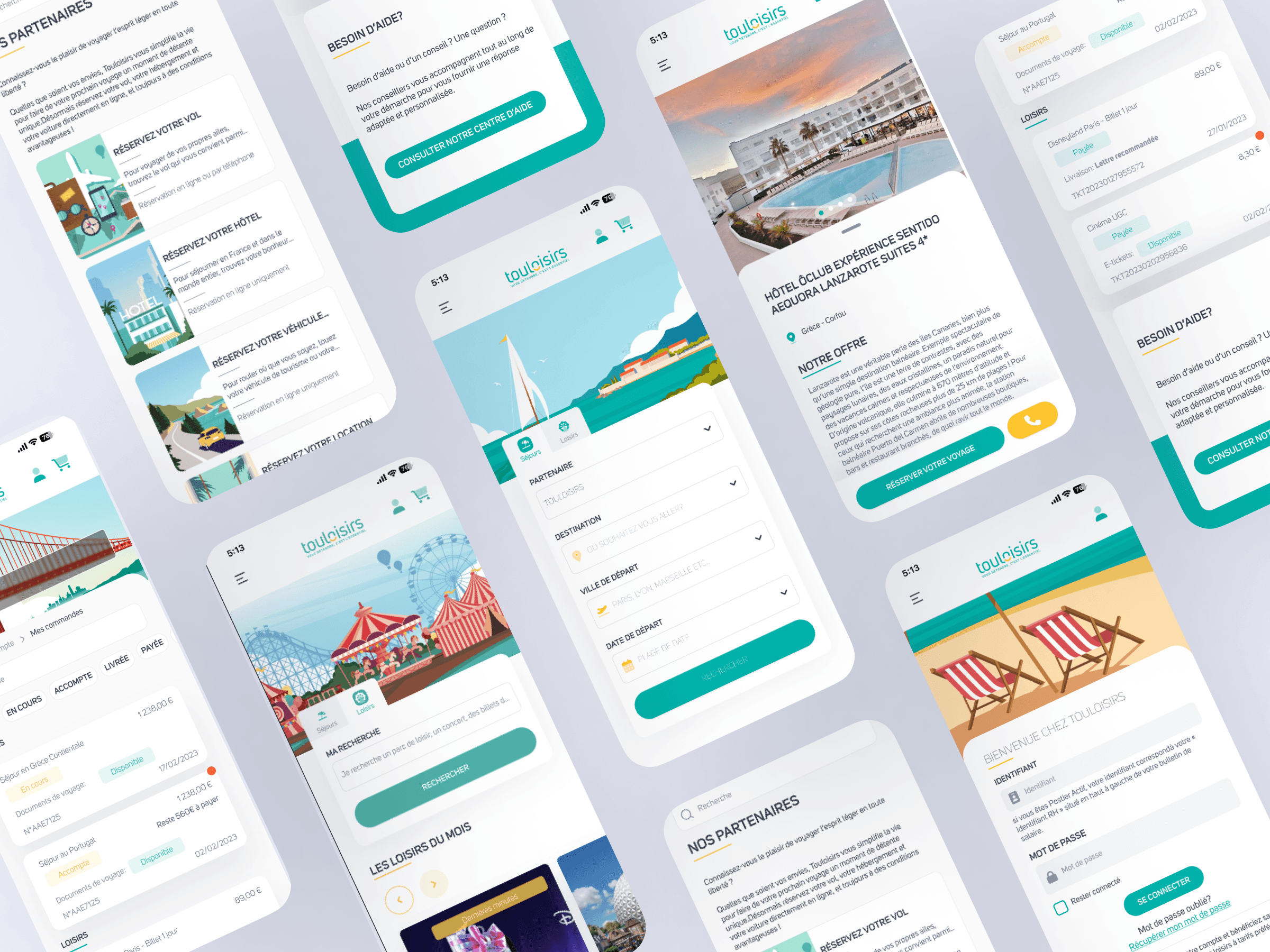
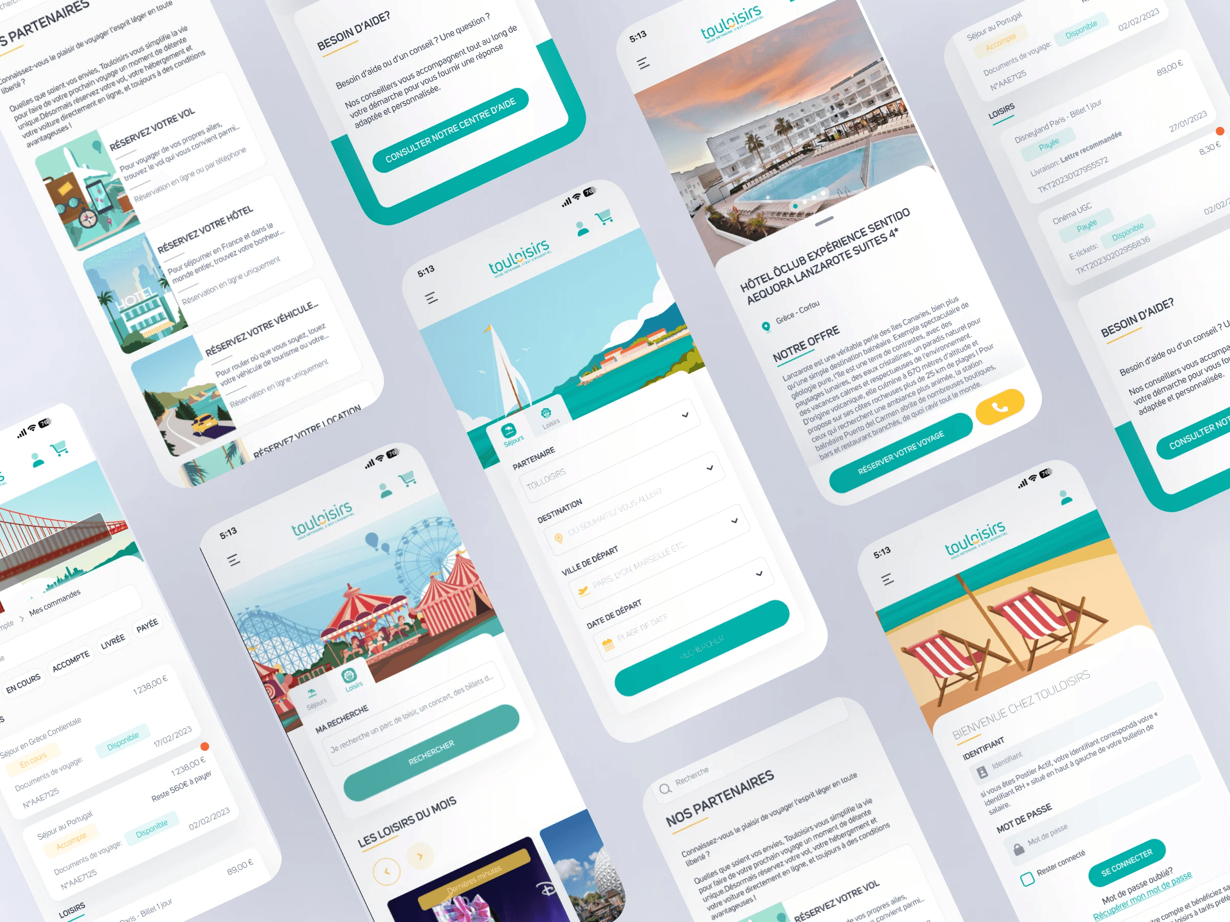
Visual Design
The visual design incorporated the client's branding, ensuring a modern, clean aesthetic with a focus on usability. The color scheme was chosen for accessibility, ensuring sufficient contrast between background and text elements for all users, particularly those with visual impairments.

Testing & Iteration
Several rounds of usability testing were conducted with target users, focusing on ease of use for key features such as the product search and checkout process. Feedback led to the following improvements:
Minor adjustments to the color scheme to enhance readability.
Simplified the booking process to reduce friction.
Added tooltips and interactive hints to guide users through the booking process and account management.
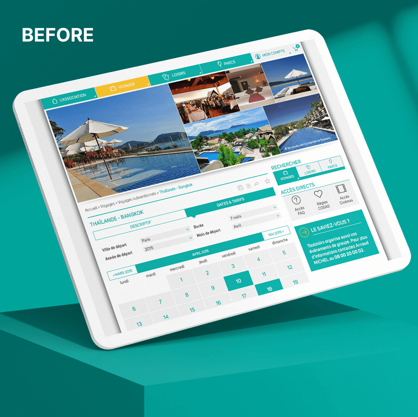
Final Product
The final design addressed all pain points identified during the research phase and resulted in a clean, intuitive platform. Users could easily browse through leisure activities, create accounts, and make bookings with minimal effort.
Results
The improved site led to a 50% increase in user engagement, a mobile user retention up by 26%, and achieved a 90% satisfaction rate, showcasing the success of the new design.


Gallery